ESPHome Auto-Restart Script
Introduction Running various services at home can be a great convenience, but it’s incredibly frustrating when the network goes down and you’re not there to restart everything. I’ve …
I’ve previously written about how I harvest the readings from my utility meters and put them into InfluxDB. This follow up post describes how I clean up that data using InfluxDB’s Flux language into something more usable.
Let’s start by looking at the data.
// This is where we select the data from
from(bucket: "meters")
  // Filter for the time window shown on the dashboard
  |> range(start: dashboardTime)
  // Filter for my electricity meter
  |> filter(fn: (r) => r.endpoint_id == "12345678")
  // Filter for consumption events
  |> filter(fn: (r) => r._measurement == "rtlamr" and r._field == "consumption")
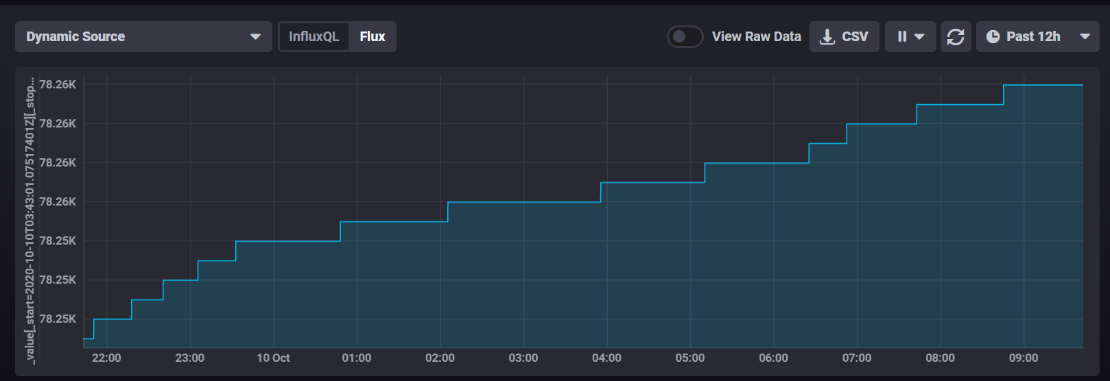
At face value this looks pretty good, but there are some annoyances in the data.
It logs data very frequently. I get a reading from that meter every 1 to 7 seconds on average.The data is very course, it only changes when we’ve drawn 1 kWh of electricity. At periods of high use, it could be changing every 5 or 6 minutes, but in the early morning it’ll only change ever 1-2 hours.
My first thought was to clean this up by applying a moving average, but since the data points aren’t regularly spaced (1-7s in my experience) it’s hard to choose a window and know what it means.
Instead I’ve had more luck with Flux’ timedMovingAverage which lets me take a 1 hour moving average and plot it every 15 minutes
|> timedMovingAverage(every: 15m, period: 60m)
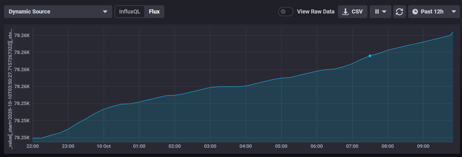
At face value that looks really promising, we appear to have taken out the step value. However, I’m not really interested in the meter reading - I want to know how much power i’m drawing at any point in time. So let’s add in a difference function to look at the change in readings (that’s not exactly power, but it’s a step in the right direction)
|> difference()
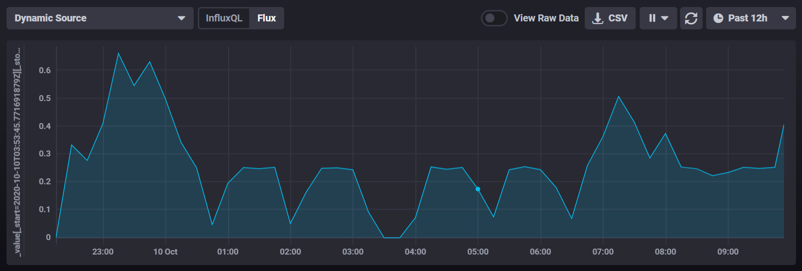
That looks like we’re getting somewhere, but this approach has problems I can’t get around. If you look at 3:30am there’s a period where it appears we drew no power whatsoever. That’s clearly not the case, it’s just that we drew a small enough amount of power that the meter didn’t tick for over an hour. I could increase the smoothing on our timedMovingAverage, but that would really smooth out the peaks.
Let’s go back to the start and instead look at when the meter actually ticks. I can use the difference function on the original data to visualize that.
from(bucket: "meters")
  |> range(start: dashboardTime)
  |> filter(fn: (r) => r.endpoint_id == "12345678")
  |> filter(fn: (r) => r._measurement == "rtlamr" and r._field == "consumption")
  |> difference()
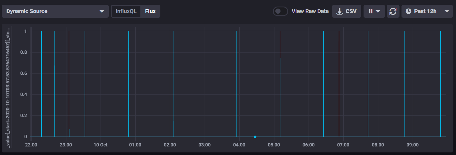
So what we’ve got here is basically an impulse stream which shows a peak of 1kWh every time the meter ticks and zero at any other time.
Let’s look at the period between 2:06am and 3:55am. That’s a period of 1.84 hours where we consumed exactly 1kWh of electricity, so by basic math we can say that our power draw during that period was 0.54kW or 543 watts.
To construct that in Influx, we’d need to measure the time between datapoints. There’s a handy elapsed() function that adds the time elapsed between this datapoint and the previous one, but because our meter reports every 3 seconds there are hundreds of 0 data points in that block. So we’ll filter them out, then add elapsed.
  |> filter(fn: (r) => r._value > 0)
  |> elapsed()
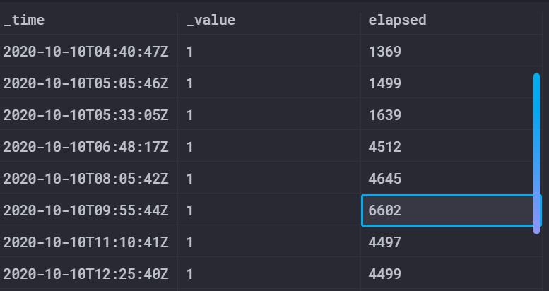
I showed the table value here rather than the chart, so you can see the exact values. Here you can see the end of that period at 09:55 UTC and that there’s an elapsed time of 6602 seconds since the previous meter reading.
From here we can apply some math and come up with the wattage. Note that we need to cast both the _value and the elapsed time into floats for the calculation to work properly. I also drop the elapsed column after I’m done so it doesn’t show up in the chart.
  |> map(fn: (r) => ({ r with _value: float(v:r._value) * 3600.0/ float(v:r.elapsed) }))
  |> drop(columns: ["elapsed"])
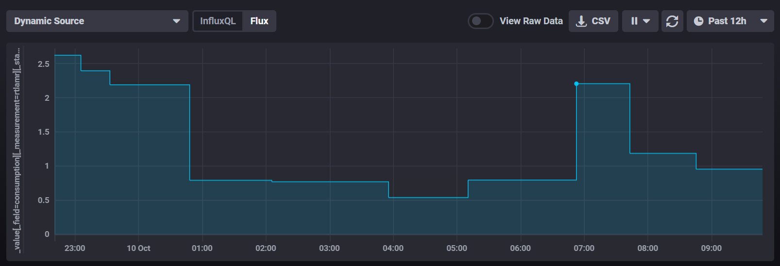
I changed the chart to show a step function and this looks really close to what we want. The low period is now showing right on 0.54kW but unfortunately it shows up at the wrong point in time as it starts at 03:55 instead of finishing at 03:55.
We need to shunt the whole chart backwards by the length of the block that just happened. Influx provides a timeShift function that can apply a fixed offset to a whole data series, but that’s not helpful when we need to vary the offset. Instead there are addDuration and subDuration operators in the experimental package that we can use to rewrite the _time column. They require a time offset in nanoseconds, so we need to multiply elapsed by 109.
|> map(fn: (r) => ({ r with _time: experimental.subDuration( d: duration(v: (r.elapsed*1000000000)), from: r._time)}))
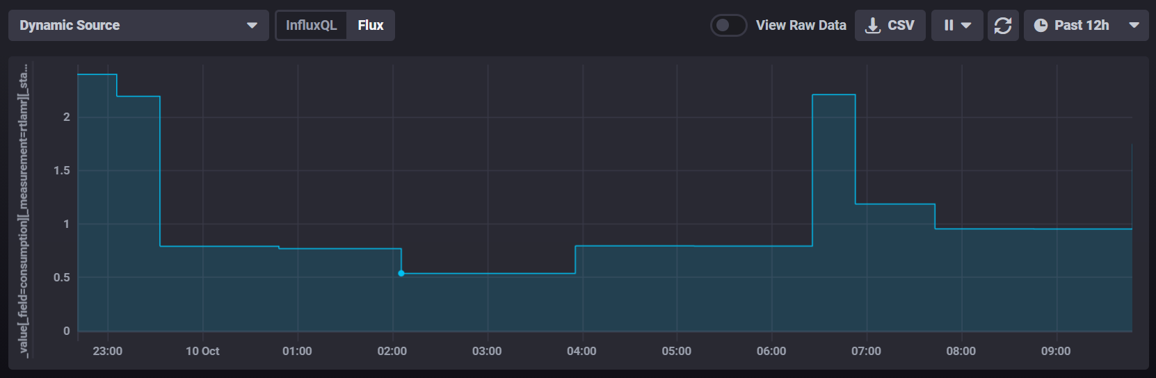
And I’d call that a pretty good result. We show smooth data in the low utilization periods and we haven’t smoothed out the peaks (like at 6:30 when the tumble dryer was started).
Curiously the integral of each block on the graph is exactly 1kWh, so when consumption is low we get low wide bars and when consumption is high we get high narrow ones.
Here’s the final Flux query:
import "experimental"
from(bucket: "meters")
  |> range(start: dashboardTime)
  |> filter(fn: (r) => r.endpoint_id == "12345678")
  |> filter(fn: (r) => r._measurement == "rtlamr" and r._field == "consumption")
  |> difference()
  |> filter(fn: (r) => r._value > 0)
  |> elapsed()
  |> map(fn: (r) => ({ r with _value: float(v:r._value) * 3600.0/ float(v:r.elapsed) }))
  |> map(fn: (r) => ({ r with _time: experimental.subDuration(  d: duration(v: (r.elapsed*1000000000)),  from: r._time)}))
  |> map(fn: (r) => ({ r with  _field:"Whole House Power"}))
  |> keep(columns: ["_value", "_time","_field"])
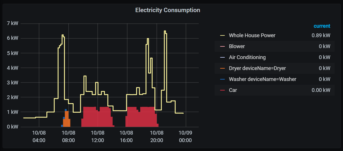
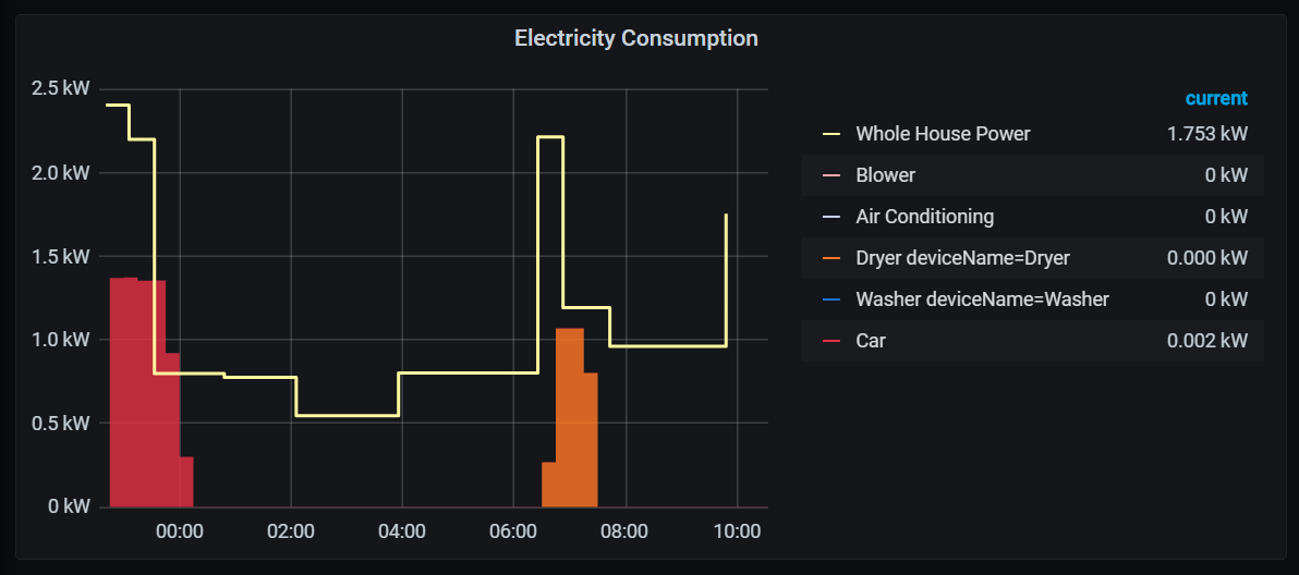
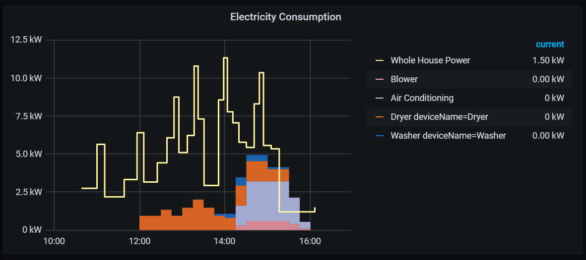
And here are a few screenshots of how that data lines up with my SmartThings data on a Grafana dashboard which shows power consumption for some of my high draw items:
Introduction Running various services at home can be a great convenience, but it’s incredibly frustrating when the network goes down and you’re not there to restart everything. I’ve …
Introduction This tutorial walks you through the steps to set up a Worldwide Asset eXchange (WAX) test server, establish the WAX currency and transfer some into a test account. This was tested on …
Introduction As part of a larger project, I wanted a way to capture the audio signal from our HiFi and sample it with an ESP32 Microcontroller. Our HiFi has a handy tape-dubbing output which I’m …